
All sorts of details now.
makeps was still producing straight dashes, which got rather spiky in highly curved fields. I added code to draw multiple segments, which got shorter as the curvature grew. No less than three segments per stroke, please. Much better.
Everything I had done used the spline object. I wanted at a few more item types -- circles, for a start. Also some sort of "constant" object which would set flat fields of vector, color, and density across the entire image, regardless of distance.
The constant object was easy. Hardest part was naming it, and deciding how to draw it in LayZ. (I decided it was an "anchor", and a little square was acceptable.) (In fact, I implemented circles before anchors, but why confuse narrative flow with reality?)
A moment's thought about circles led me to change them to ellipses. More general. A circle can be defined by a center point and a radius. Conveniently, my figure data structure had two control vectors per point (since it was designed for splines first), so I might as well use those for major and minor radius. For fun, I didn't constrain those axes to be perpendicular -- I wanted to see what would happen. Turned out to just be more ellipses; but the drawing algorithm didn't choke, so I left the capacity in there.
Adding the ellipses to makefield was harder. The algorithm was another half-page of calculus (okay, trivial calculus and algebra.) But the ellipses turned out to be weaker than the splines. Their influence on the fields got swamped. In fact, the anchor objects had the same problem. I spent a lot of time fiddling with multiplier coefficients, trying to get everything balanced.
One of the spline-laying features I'd wanted from the start was the ability to have curves and corners in the same spline. Well, sure, you say. If you can move all the control points, you can make it do whatever you want.
But I wanted to mark a bunch of points and have a smooth curve between them, except for (say) a single sharp corner. Automatic adjustment of the control points in the smooth regions; none at the sharp regions.
So I added an attribute at each point (XML is nice): the join. The point could be a "corner", "clean", "smooth", "flat", or "free". Those being all the constraints I could think of. "Corner" means a point whose control vectors are zero; it will always be a sharp corner, and two "corner" points will always have a straight segment between them. A "free" point could have any control vectors at all -- no adjustment. "Flat" means the control vectors are parallel, so that the curve is flat there, and "smooth" means they're parallel and equal.
And "clean" means that... um... I never did figure out what "clean" meant, really. I wanted something where the control vectors were set automatically to make the simplest possible curve that joined all the points. No doubt there are several good ways of doing this. I didn't find any of them, so this capability is still missing.
Points have another attribute, too; their direction. Basically that decides whether the local vector produced by each segment is parallel to the segment or perpendicular. (Or neither -- a segment can have no vector influence at all.)
I only mention that because joins and directions were the beginning of the end of LayZ, as a non-sucky piece of code. Heh. I wanted a way to quickly set the join and dir of any point, so I stuck in some keyboard commands. "option-j" to select a new join, for example, and "j" to set the selected point to that join. I also threw in "shift-j" followed by a number to set a point's join by number. If that sounds confusing, it is. It would certainly never fly in a real program. But (and therefore) I'd given up on LayZ being a real program. I would use it, no one else.
Besides, if I wanted to release it publically, I'd have to figure out what "clean" meant.
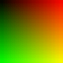
A bit of a side-track followed, which you'll have to pardon. I'd gotten tired of viewing vector fields in red/green, which is how topnm rendered them. Up, down, left, and right were represented as dark red, light red, dark green, and light green; with black, yellow, red, and green in the corners. Hardly intuitive. I wanted to transform that into a straightforward color wheel. HSV color coordinates, in other words.
I've done that before, but of course I didn't bother to pull out my old code. I just tossed out some code and started testing it. Took me a good half hour of shoving number ranges and coefficients back and forth before I got the right result. I'm all for experimental code development, but sometimes a little theory is worth the effort... heh.
At this point, I'd generated stroked images from all sorts of test cases -- single splines and ellipses, with and without anchors, plus combinations. But I figured it was time to test a bunch of figures systematically. Any complex image would be made up of simple combinations, and I really needed a grasp of how vector fields interacted.
So I spent an evening just rendering figures, and sketching the results.
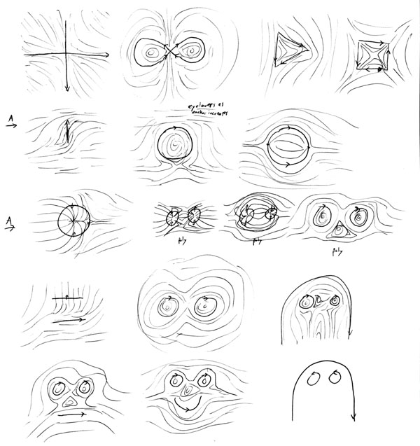
Various test images (link to larger image)
I had implemented color fields in makefield along with vector and density fields, but I'd never done anything with them (except view them with topnm.) Time to work them into the final image -- that is, add another piece to makeps.
Simple in concept: convert the color field to a PostScript image operator, and draw it before all the pen strokes. But the PostScript image operator is sort of annoying. It has a transformation matrix, and I'm used to handling transformations with separate scale and rotate commands. (If you have no idea what I'm talking about, don't worry too hard. PostScript is an esoteric taste.)
I copied some code from the Red Book (Adobe's PS reference manual), but I had to experiment more with the matrix. Okay, it seemed to work.
And after all that, I stuck some green mountains onto a blue-anchored sky and realized that I was doing it wrong after all.
Tricky to explain, here. The short form is "Don't normalize the vectors twice!" I don't know if I want to get into the long form.... To normalize is a vector is to throw away the length, or intensity, leaving only a pure direction. In medium, I was adding up the vector influence of each segment in a spline, normalizing that, and multiplying by the total influence. That gives a direction-and-strength for the item. Add those up and normalize, and you have the final direction. Right?
Well, no. I had been bothered by that extra normalization for days. It gave the right result, I thought. I tried removing it, and wound up with an extra factor of "length" in the result. So it must be right. But it wasn't. I should have been returning a non-normalized vector, not multiplying that by the total influence, and then adding up and normalizing.
Okay, I'm not explaining it very well, but there's a difference. The same difference, roughly, as between the sum of the squares and the square of the sum. See?
And like that analogy, you don't notice anything wrong when there's only one item involved. Once I had more than one item in a figure, problems showed up... although they were subtle. A parallel strip of field along a segment that should have been neutral. Lucky I noticed it, I guess.
Interestingly, when I fixed that, the anchors and ellipses got stronger. I was able to take out the multiplier coefficients. Okay, most of them. But it was definitely a sign I'd gotten it right.
The colored mountains showed up another problem, too. The pixels were awfully visible, though, particularly along boundaries. (PostScript is resolution-independent -- there are no pixels until the final output is rendered -- but a color field, which is to say a raster, is made of pixels inherently. My makefield defaulted to a 128x128 grid, but the final output would be much finer-grained than that.)
So I tossed in some simple blurring code, averaging four adjacent pixels into one. In fact, this was just the linear interpolation code I already had in makefield. Problem solved.
But only for square images, not rectangular ones. Oh great. My approach to rectangular images had been shaky all along, even though I knew I'd almost certainly need them. But makeps was stretching and cropping the color fields. Much matrix-diddling ensued....
...And the result still didn't look right. Because, I realized, my linear interpolation code had had a bug right from the beginning. It assumed a square image. Time to tear that out by the roots -- which meant redoing a lot of my approach to rectangles in the first place. And, of course, checking that early interpolating stroke code to make sure I hadn't broken it.
And much matrix-diddling ensued. Again.